my very first album of renders :D Updated with more often!
 Noved1
Posts: 160
i was recently inspired my the encouragement of fellow CG'ers to get to rendering, instead of just modelling. everything you will see here is likely highly modified, and has had postwork done on it. though they are fairly simple. (i dont like to leave my renders bare). for my first ever renders, i think they are ok. some use all custom items, while some use people and things from the shop. more renders will show up at the bottom of the thread.
ps.i use my own custom lighting script. and some are rendered in a 3dlight standalone program.
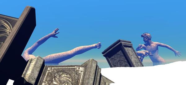

titan_valley_3.jpg
1114 x 511 - 56K
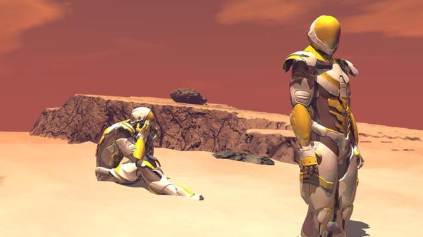

desert_with_guys.jpg
889 x 500 - 44K
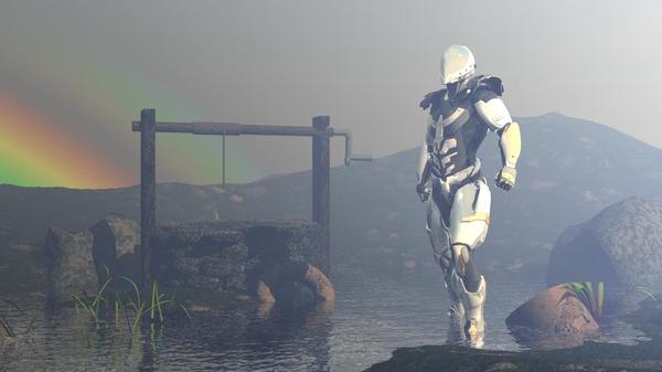

fogy_well.jpg
889 x 500 - 41K
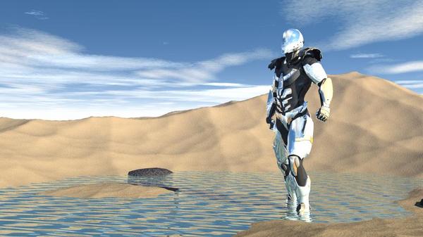

beachwithtrooper5.jpg
889 x 500 - 64K
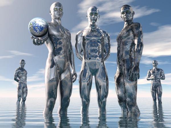

them3.jpg
810 x 607 - 78K
Post edited by Noved1 on


Comments
and a few more. please tell how i can make these better here, as im sure there are methods iv never heard of. i ll take any ideas :D that one at the bottom is the first scene i did with any kind of action going on
Love the emotion in the renders, can easily tell what the character is feeling. On the third one down, is there supposed to be a shadow there? The surface (blue is supposed to be lying on the plane, right? (Am I making sense?)
I wanted to post that separately, now to continue- I absolutely love the lighting- it really contributes to the feel of the scene. It's muted to a perfect degree, not too bright- and of course this is all just personal tastes, but I like the degree of illumination. I'm a newbie at rendering though, so that's just from a viewer's point of view and not a technical one :)
So far as action goes, I would suggest a bit more power in the troll vs soldier/gladiator- the shoulder nearest the camera needs a bit more OOMPH in it. I'm not feeling quite as much energy as it's being connected with- I think it would go back a tad bit further, and the fingers on that left hand would curl a bit more to get a better grip? Looks a bit loose. That dude would want to hang on to that beast for dear life, literally!
Again, the color scheme is awesome, the lighting is brilliantly done. And I'm just being nit-picky you understand :)
hmm, that appears to be a tear in the texture plane i made, or maybe...i missed a rock i left floating in the air? im going to go check the scene and see what that is.
and novica, being nit picky is what makes renders have those fine details that make a huge difference. :D
Yeah, I just finished three posts in my studio thread about that right before I surfed over here. (About what the character is thinking, the nuance.) I just feel SO sad for the stormtroopers (don't know what to call them!) where the one is sitting down, totally forlorn- I just want to drive by in a dune buggy and let them hitch a ride, and give them each some Gatorade!
Cathie
ha dont worry, they may still find a way off that planet. ...maybe when i buy some vehicles from the shop, or make my own :D
Watching this thread :cheese:
You may also want to consider deviantart ;-)
WONDERFUL! So happy to see this Thread. Lurking around for more posts.
and a few more. these are mostly lighting tests.
Nice renders--and modeling! I really like the reflections in the top image, in particular. Looking forward to seeing more of your work! :)
i finally got around to making more. here they are!
I love your work, the expressions and body language come across so well.
thank you :D ironic, because i always feel like i have so much trouble with making them have emotion. i suppose i just have a muted view, because its my own art . and one more render. this one featuring yours truly.