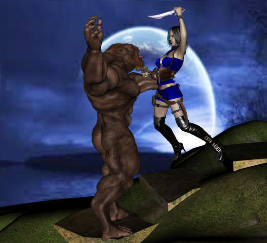
First Time Render, Critiques Wanted and Welcome
This is my first attempt at a full Render using DAZ3D 4.5 Pro and the 3Delight Render. I used the default lighting and cameras. I also used the default render settings in the 3Delight. I Brightened the render just a tad in Photoshop. I would love an honest critique from some of the members here as to what looks good, what looks bad and what I can do to improve the shot. Thanks for any input.


Lycan_Slayer_4_upclose.jpg
846 x 772 - 110K


Comments
The pose and positioning are pretty good. Of course, to get a professional look to your work, there are quite a few things you can do to improve an image, and we'll start by moving away from the defaults. Here's a few tips to get you started making beautiful works.
Lighting
Lighting is KEY in any work. It's the bread and butter of making even the most basic works into an art gallery piece. If you only take one piece of advice out of this, then lighting would be the one to take.
Firstly, the 'default' lighting is a headlamp. It's basically a light attached to the camera (perspective camera or otherwise) invisible in Daz Studio which always shines directly forwards. Unfortunately, this results in a very flat image, with no real depth and leads to unrealistic results. A lot of work I've seen from beginners makes heavy use of this, so be careful not to fall into the trap.
For impressive results out of the box you can use UberEnvironment (UE). There are a ton of settings you can play with here, so it's easy to be overwhelmed by options to begin with. But start with the basics and move on from there. Just by putting in the default UE light and changing the quality settings using the presets you'll see a massive difference in render quality, and it will bring out the details in your image well.
The more traditional approach is known as 3-point lighting. This involves using three directional lights such as either a spotlight or a distant light. The trick here is to aim them so that you catch different sides of your models. Two lights in the front, either side of your camera, one with full intensity and the other with a reduced intensity (something like 40% might work). The other light goes opposite your stronger light BEHIND the subject and generally has an even higher intensity, like 150% or even more. The result is a figure which has a good sense of dimension, and a sharp outline.
Of course with all of the above you can change the lighting colour to match the mood you want to set. Check the examples below for a quick idea of what they do. I've also included an example of what you can do when you combine some of these ideas. For the purposes of demonstration, I'm using V5 Tori, with Hampton Hair and all the material settings are left to defaults.
Backgrounds
One of the issues your image has is that the background suffers a great deal from JPEG artifacting. Using a good high res image will clear that up, but there are several ways to go about adding a background to your image.
The obvious first choice is to simply have an actual background to your image. Whether it's a small prop or an elaborate building set complete with fine details, it will be rendered along with your characters and be subjected to any of the light settings you've provided, which can truly immerse your characters in their world. So-called 'sky domes' or 'sky boxes' are popular and easy ways to add a sky and horizon to an image.
Another method is to add a background in post work. By default, any part of the image not covered by a model of some kind is rendered as transparent if you export to a format which supports it (I use PNG). You can then open that up in your favourite image editor, such as Photoshop, and layer in a background beneath it. Doing it this way gives you a large amount of control over how it looks, but character interactions with the background will be significantly harder to accomplish.
Here's two of my own works as examples of each. The first uses an actual set, the second uses a background added in Photoshop.
There are, of course, a lot of things which can go a long way to getting the best out of your work. But start with those basics and you'll see a massive improvement in just a few easy strokes. If there's any topic you'd like me to go into more detail on, feel free to ask. I don't bite. Much.
Thanks HaroldofFire, I really appreciate the advice on using lights. Sorry it took so long to reply but I wanted to try out your suggestions. This is what I came up with. It was difficult but fun trying to come up with what I wanted. I was looking for a, just after dark, look with a few shadows. The difficulty was getting enough light so you could see the colors of what she is wearing and still make it seem it was night.
I did two renders. One with fog for a London type feel and one with out.
Here is the one with fog
Looking very good. In a short time you've already improved considerably.Incidentally, one tip for making night time scenes is to either tint your lights a slight blue colour to simulate night. Don't make it too deep a blue other as it will darken all of the redness in the image, but adding just enough can work well. The other way to do it is in postwork by taking your image into an application like Photoshop or Gimp and applying some blue tint filters.
Out of curiosity, what's the prop you're using for the background? It looks familiar, but I'm not sure I have that one in my growing collection.
Thanks for the hints about using color for the night effect. The prop I used for the background is the building from DM Gadomar.
Best basic advice I can give that hasn't been said yet, work your camera angles. Right now they're kind of head-on to everything and not so dynamic. If you angled them and zoomed in closer to the subject or action it would get things to pop better.
In the first, you could lower the camera and angle it up so you're seeing the woman with the knife coming down towards you, while also getting the troll to appear even more hulking and threatening in comparison, I'd also move the camera a bit further behind the creature. Posing might need a bit of adjusting, but it would really help with the impact.
In the second, try zooming in so the woman's head is near the top of the image and her feet are near the bottom [not touching, though, give some space or it'll feel cramped], then move the camera to the left so she's standing to the right of the image, around the 3/4 or 4/5 mark. Alternatively, you could have her stand at the left of the image so she's looking into the rest of it, but I think it would work nicely to have her staring off-screen, as it were. It adds a bit of tension to the composition.