JANUARY 2013 New Users Contest WIP Thread
 DAZ_ann0314
Posts: 2,860
DAZ_ann0314
Posts: 2,860
This thread is intended to be used to share your progress or possible final submissions with the members of the community as well as those running the contest. Please feel free to post your images for advice and tips, to get feedback, or to even just simply show off your hard work! :) Throughout the month myself and others will be popping in to give help and advice as you work to make your creative visions for the contest come to life.
To start things off I wanted to give you all some links that may be of use when approaching your image this month:
Previous New User Contest Tips and Help (Hey it's reflection time for us as well ;))
July New User's Contest Tips and Help
August New User's Contest Tips and Help
September New User's Contest Tips and Help
December New User's Contest Tips and Help
Special TY to the Community Volunteers for all their hard work on these contests over the last year...you all truly are the BEST, I can't say it enough :)
Helpful Steps while approaching this Project/Contest:
1. Examine your original image. What do you love about it? What do you dislike (as artists there is always something LOL)?
2. Did you convey the feeling or message you wished to in your original? Did you set the mood as you intended?
3. Did you focus more on certain aspects of your creation while possibly missing smaller details in other areas?
Once you have looked over your original and begin looking at it from a different perspective, then ask yourself these next questions (tied in with the three above):
1. In the areas I dislike, what could I do that would make me like it more. Have a learned something new? Is there a new approach to the image I could try?
2. If you dislike the mood or feel you missed the message or feel you were trying to convey, are there new ways you could approach it? New lighting, a different pose, different post work?
3. If you focused on one area more then the overall image (I have this trouble all the time LOL) could you improve the overall details of the image? Add more that would help pull everything together for a more complete look?
Please also note for those brand new to 3D in general you may use a sketch you created or drawing or a 2D image you created in an app like GIMP or PSP or Photoshop and translate it to 3D as well. When you post in the contest thread just be sure to attach a scanned image or photograph of your original sketch if its a hard copy or post the original image from GIMP etc. :) If you need help doing any of that, please just let me know.
In the coming days I'll post some before and afters of my own to this post to show some examples to try and help show how sometimes revisiting a composition can help you gain insight when approaching new compositions as well as how it can additionally help with confidence as you see your own growth over time :)
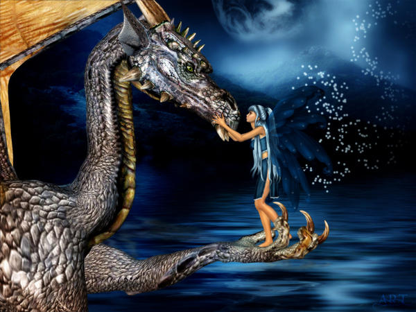
As promised here is a rework of mine as an example :) The original (or the one that is mostly blue) I did back in 2005 :) It is by far one of my fav images and was something I did not when I was necessarily new (but sadly I lost alot of those images :() but rather something I did a few years after getting into 3D.
So I picked this image and went through my little self assessment. :) I picked it cuz I always liked it but there were things I thought maybe I could do a little better or that may be fun for me to try to do different :)
So here is my assessment (just as an example) so you know what I saw when I looked at it the other day and chose it.
1. I love the general concept...cute and sweet and has my two fav things...fae and dragons :) I disliked that the pallet I chose was "so blue" to me that it lost some of the magical quality I was hoping for. Also I've learned quite a bit about lighting and adding slashes of color etc that I thought would be fun to add in and quite a bit more about painting clothing and hair so I wanted to try those things out on it.
2. Maybe all that blue may make it a touch "sad" looking as where I wanted this to be more sweet and touching and colors can convey mood (or rather pallet choices) so I wanted to get away from that and also possibly add more separation so the focus (the fae and dragon) don't blend in so so much. I think I missed the mood possibly a little because the pallet was blue. Maybe not horribly but it seemed fun to see what a change there would do.
3. I focused alot on the Posing of the girl in the original and not so much the dragon so the dragon kinda looks disinterested or not as invested? Also I noticed while she went in to smooch her friend, her eyes weren't closed which I thought maybe took away from the softness of her giving her "pet" a little smoochie hehe :)
So after looking it over, I reworked it as you see in the second image that contains the multiple colors with the pinks etc in it. I paid more attention to the Pose of the dragon so it seemed (at least to me) more engaged in the scene, added some splashes of color, added in a little DOF to accentuate the foreground more, repainted the hair and clothes and added a little jewelry as well this time. Had her eyes closed so it looked more sweet and loving and softer. (Though I do note I liked the initial pose of the girl a little better in the original but try as I might I couldn't seem to replicate it ROFL)
Now, whether the first image or the second is better for the viewer, I'll leave up to you all...but it was fun to see how I could apply things I've learned since 2005 as well as get to see comparatively how little tweaks and changes here and there would affect the outcome :)

Daz 3D is part of 
Connect
DAZ Productions, Inc.
7533 S Center View Ct #4664
West Jordan, UT 84084
Licensing Agreement | Terms of Service | Privacy Policy | EULA
© 2025 Daz Productions Inc. All Rights Reserved.
Comments
My earliest attempts at using DAZ studio never even made it to the render stage. However, last year I kind of got some decent results, born of desperation and the need to make ebook covers. But I don't like "kind of decent," so I've been redoing the covers as I learn more. Been thinking about doing one of the ones I love/hate the most over again now that I'm finally learning how to make things look right.
Wow. I just looked at some of the ones I've already redone and the early ones are pretty bad. So. The original file didn't save with the pose I rendered, because at that time I didn't know about the difference between the perspective camera and the other kinds. You know, the ones that save exactly what they're looking at? *sigh* But here's the current cover. What I like: at first glance, the girl looks like she's got a special secret.. I like the glow on her hands, and the contrast with the black background. What I can't stand: Skin color!!! Ugh. Looks like she's as plastic-y as the average Barbie doll. Didn't know how to get rid of the nail polish. Not too fond of the overall shape of her face as relates to the character in my mind. Some minor hair issues. That ball of magic just plain sucks. Her ear never picked up the magic glow. And the color of her lips makes me a very unhappy camper. (Yes, I know, minor detail. But that's the one that really bugs me.)
There's another cover that I desperately need to redo, too. Might even get brave and do both at once. Looking at my newer covers versus the older covers is making me cringe. And hey, here's one that would benefit from some better lighting...
Well it sounds like you've pretty well got stage one and two of the prep for this well under hand :) Sometimes the hardest thing can be looking over past work and not being either too too hard or too too easy on yourself but finding a good balance which is why it is good to look at both the things you love and dislike so you know where you think you did well and where you could improve :)
In art you'll find its mostly subjective based on who is looking as to what may look right and what may look wrong but making it right for you, the artist is the big step I think...once you feel comfortable with your work then you can begin to experiment with what a general audience is appealed by (which can be harder to gauge) so this is a huge first step in that and an important one. I know I constantly re-evaluate my artwork etc...and it fascinates me how today I can think something is amazing...6 months from now I can be all UGH why did I do that LOL and a year or two later sometimes I'm like UGH I hate that now ROFL but I think doing it is a very large part of what pushes you to keep learning and trying new things and its definitely a wonderful thing :)
I can't wait to see the before and afters on your stuff, it seems you're off to a wonderful start! :)
If as you work on this there are things you feel need done but aren't sure how to, please do ask as we are always here to help. I know you mentioned some things about the nails and skin etc, if you need some tips on adjusting those things for your final composition/rework in DS please let us know :)
I did this one as a card for my sisters birthday a few months ago and she really liked it. I feel that i got the pose not too bad, everything else needs improving. Need to work on the composition, surfaces, background and lighting, oh! better not forget the camera angle.
I really think this is a great idea for this months challenge, I have a few that I am sure that I could improve on.
Looking good...you've both got a good start!
I'm not a new user but there's an image I did years ago that I've been thinking of redoing if I have time I'll post some images myself...
Nice idea Ann
I would like to add something I have wanted to share for a while now and it has to do with this point you raised
I often see newcomers explaining the message of an image via a paragraph or two of text. If you really want your images to say something then best leave that to the image itself. To be very frank if an image needs explaining in terms of the message then the image isn't working right IMHO.
Many of my images don't really need titles as the meaning/message.story is plain to see. I just find a well thought out title can add weight and reinforce the intent. But like many I don't get it right all the time and I too have some I would like to redo.
Yes, please! Skin. It's something I've been wanting to learn about for a while now, because if you look close, all my characters have the same hide, just sometimes altered a bit in Photoshop. I did get that awesome-looking Interjection from DimensionTheory, but I must be messing something up because it usually renders with glowing orange cheeks and I can never get the eyes to behave. I know I'm screwing up a setting somewhere, but whenever I try to deal with it my brain just short-circuits and I run away screaming. There's a whole lot of little sliders and numbers and other stuff in the Surfaces tab that I have to walk through with a tutorial holding my hand. I'd really appreciate any tips, pointers, etc on getting skin to look good in anything other than the default state.
And as a side note, I did an image over the weekend I really like, and it involved a guy with no shirt, leading to the conscious realization that the "basic male" character is missing something up top. I wound up compositing M4's chest onto the basic male skin to give the poor guy some nipples. Is there an easier way to do this? I know I'll run into the problem again sooner or later.
And just because I love it dearly, here's the image that finally made me a very happy camper this weekend.
sithkitten I will come up with some help for you it will just take me a little while to get it together
a-up Neil hows things these days...nice xmas and new year I hope?
Someone's got a birthday coming up iirc...
*waves at Neil
Someone's got a birthday coming up iirc...
*waves at Neil
Hi things are going well quiet Christmas and you both.
OK for help with Skin settings
If we look at the basic surface texture of a figure there are a few areas we need to look at:
Diffuse (this is where you get the basic texture loaded)
If you are loading in a Poser mat you may notice a blue tint in the colour channel I tend to get rid of this my self (personal choice) as it’s not needed in DS unless you are thinking of using Interjection SSS at a later stage. Apart from that I tend to leave this section alone.
Specular (where we change the highlight settings)
This is were we need to do the most work and what ever work we do here needs to be tested against your lights as some setting will work and others wont But I will give you My basic starting settings.
Glossiness I tend to set to around 60 or 65% this gives a nice highlight with out making it to shinny you would only go higher if you was thinking of making a wet or sweaty looking skin you may want to drop it lower though if you want to spread out the high light more.
Color depending on what colour has come in with the mat if it’s a nice fleshy tone I may leave it as is otherwise I tend to put it to a grey at 192.192.192 or light tan at 177.155. 188 depending at what the skin texture is and the type of effect I am after.
Strength before testing with lights I will set it to 25% but you may need to move this up or down after testing (too high a setting can change the colour of the texture) some textures set come with Specular map can be found with a –S at the end normally loaded in the strength channel (will not load in if it it’s a poser mat and will have to be loaded in by hand) and this controls the highlight better in this case the strength is normally set a lot higher around 75 to 85%
Ambient (I use this channel I know some people disapprove of its use and I will explain why.) now some people say if you use this channel you get a glow in the dark effect I think that’s more true in poser or if you set the setting to high but used in moderation can help to tone the skin if you are going for a pale skin adding white here is good or if you want a nice tan you can add a darker colour.
For general skin I tend to add light tan 177.155.188 (don’t add the same as used in the Specular) at 10 to 15%
Bump
Bump maps can take a lot of work to make look right as you have to work out if thy have been made to work correctly in DAZ Studio (look like a grey scale texture) or are poser bump maps (just look grey) I tend to set the strength to 100% and adjust the negative and positive settings. If they are DAZ studio Bump maps the settings will be quite low -0.035 and 0.035 were as if they are poser maps they could be -2.0 and 2.0 I tend to with all the textures selected remove the defuse texture and do a test render so I can just see the bump then use the undo to replace the defuse texture and adjust and repeat.
Displacement
If you only have poser mats the displacement mats do not load over you have to go looking for them What I tend to do is put the bump map so that when I click on browse I am going to the correct folder if there is a displacement map it should finish with a –D instead of a –B Displacement maps don’t need to set to high and the same map work reasonably well in poser and DS again apply and test the same way as the bump maps
Lighting model
The lighting model has two settings we are interested in which is plastic or metal both work quite well with skin you just need to play and see which effect you want as it may change for different renders.
Here to show is basic M4 default load using setting from here and rather than doing lights myself I am using the medium fashion lights from dreamlight studio light pro. With these lights I would possibly drop the Specular strength a little bit more if I was using UE lights the Specular would be reasonable.
Hi things are going well quiet Christmas and you both.
yeah, good I'm on holidays until the end of Jan. Christmas was busy as usual.
Thanks a million, Neil! I just read through your post and saw several things I've been screwing up. Thanks for being more specific than the tutorials I've read and giving me your settings. It helps a lot to know in advance something will work. and to have a real reference to keep me from doing anything too crazy.
You can directly use M4 and V4 skins on Genesis so any skin textures you already have or any readily available freebies can be used.
-----
Wow, this contest. It seems right up my alley to the point where my main difficulty will be choosing what to re-render. A lot of older (and honestly a number of newer) images could stand having new life breathed into them.
yep if you go to the surface tap and select all the surfaces together then go to "UV Set" you can change it to what ever UV set you wish to use as you can see is start out set to V4 once you have selected your UV set if you click on the padlock icon to lock it in place even if you try different texture sets it still stays on the same UV set
Now for the really dumb question. What's a UV set, and what's it got to do with skin? I've run across lots of mentions of UV, but so far have only a vague notion of how it works. Very vague.
Without Uv Maps http://en.wikipedia.org/wiki/UV_mapping the textures wouldn't line up on the mesh as they do. Think of it as a texture template, a grid to guide us to where the texture maps should be made and what shape it needs to be. We get a lot of templates in our content or sometimes Daz3D makes then available on the main product page under the Resource Files tab at the bottom of the page like this example http://www.daz3d.com/dream-home-yard-and-pool
Genesis is one of the few character models which improves compatibility by having the ability to change which UV set it uses for a given surface. This makes it compatible with previous texture sets such as V4 Lana and M4 Lee. As shown in the earlier post, there is a simple drop-down box in the surfaces tab if you want to change to a different UV set.
this was the one I picked for my first time entering the contest, my idea of a pin-up, I just knew I was doing good till I saw some of the other entry's, then looking back I still have trouble with lighting, and posing, I liked this one because to me it was new, something I never tried before. but the more you learn the more you look back and find things I could have done better, so I know you will be seeing this one again as well as one more, and I hope I learned something
Thanks for the responses about the UV stuff! Sometimes I feel so clueless in this program, but that just makes it more interesting.
So as promised here is my original render, which was a very early one using Laura as a fairy. IIRC it was a Thorne/Mada Character and it's very basic. I posed the model, stuck a dress on it. Hoped like hell there was no pokethrough and stuck a background picture in. Like I said very basic. It's from my first year of rendering.
I've been thinking that I would like to redo a new image of a fairy...but she had a mind of her own and instead is going to be an angel. ; )
She was nspired by the James Christensen style of angel seen here...
http://shambala25.wordpress.com/2009/11/11/the-angels-of-james-c-christensen/
and Renaissance paintings of angels...all mixed together.
https://global9renaissance.wikispaces.com/Naomi+Manning
http://www.visual-arts-cork.com/history-of-art/proto-renaissance-artists.htm
http://www.flickr.com/photos/10782886@N03/966093591/
I used the backdrop from photostudio 3 by Inane Glory and his freebie light the softbox preset.
The camera is Age of Armours fog camera.
Halo is Jepes hero extreme special effects and his deluxe fog creepy is also in there.
Genesis with Deborah applied, bloodmage hair and epic wings. The dress is the empirewaist from the historical gowns for V2 autofitted using V3. Sleeves are from the MFD expansions and I've used a Calida Lush shader for the dress and short sleeves and a different tonal version for the long sleeves.
This is a wip not a finished render. I can still see the following that I need to work on...
1. Scale on the sleeve is different to the dress I need to increase the scale on the sleeve so it matches in size.
2. The left wing tip is sticking out at the back and looks like its part of the hair gone wonky.
3. I need to look at the placement of the lights to get better shadows.
4. I want to tone down the colour on the long sleeves and also try a crushed velvet shader from Fisty's sparkle shaders. Preferably something in a darker brown. My aim is to have the skin colour be the brightest colour and the face the focal point.
How has my work flow/style changed from early to now?
1. I'm more likely to kit bash an outfit together from pieces and use shaders to make them into a cohesive whole.
2. Use of shaders in general for example using Age of armours fog camera to soften the image.
3. I have a better idea of what I'm trying to achieve overall and have certain artworks that tend to inspire my work and I'm gradually developing my own style.
Revisited these two images done in DAZ 4 from the very beginning. There is also one I did for a contest on here a year ago( can't remember which month it was) with a young lady stumbling upon the proposal of marriage but it had no shadows. Have to dug up from the old forum if it can be accessed. Anyways, here are the ones and also got this wrong type of shadow on several renders so if you know what causes these...
Below is the image being done at the moment.
Wow! I had no idea you could use bits and pieces of stuff! How inspiring, for the times when I like the shirt but not the sleeves for this image, etc.
sithkitten if you place the end part of the "[ /quote ]" (minus spaces and quotes) before your text you will avoid the confusion it can cause.
Kit Bashing is so much more easier in DS4.5 than it was in DS3 with the advent of Geometery Shells and Collision.
My only clothing kit bash image I have done becasue I found it awkward in DS3 to do.
I think this image was made up of parts from 4 clothing sets.
With the light, try to play around with shadows.
Question does she leans against the tank?
You can even do Kitbashing ans use Bryce mats from the DTE, I used parts of 4 different outfits with this one.
Oh yeah I remember that one chohole. I think I said it before that you did an amazing job of kitbashing there in Bryce and Poser. :) You're just showing off now. ;)
Yep...but she has a lot to brag about! lol
Beautiful work Cho!
Yes Pete I have to admit I did it just to prove that Bryce is capable of producing "shaders" The main striped fabric is purely generated from the DTE, with no jpg input. The others have a little help from jpgs, but not much