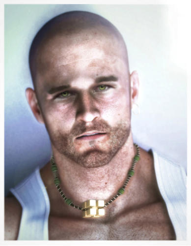
My first photo-real rendering (the journey)
 Jake_35533
Posts: 242
I always dreamed of making a photoreal image. I attempted many times but could never achieve those high level renderings I always see in 3D magazines like 3D world and 3D artist. So when I found the Reality pluging for Daz, it attempted to make a photoreal image. Here is the final image below. I will take you through the process of how I made it.
Disclaimer: This is in no way an instruction on how to make a photoreal image, but rather an journey of stumbling and experimentation that brought this image on accident.


EYE_SEE_GREEN_(reduced_for_upload).jpg
1555 x 1999 - 480K


Comments
My image for the inspiration of this rendering. Since the eyes are considered the thing that gives your characters that realism, I decided to photoshop the eyes onto the final image to see if the realism would increase.
So I went to Daz and set up a scene. I didn't have realistic hair at the time, so I chose to make him bald. I set up one soft box light off to the side, one mesh light under the face and one HRDI light and rendered it.
1. Well, my first rendering was good but not photoreal like I wanted it. So I decided to use my photoshop skills to force elements of realism into this otherwise flat image. The eyes were not good but I knew I would fix this later. It was better but something was still wrong.
2. I knew the skin needed to be softer and a little more red in the skin so I upped the red a little in "selective color" and overlayed a blurred image with like 25% opacity over the image to give it a soft look. (I found out later that the professionals do this too). I knew the ears and nose needed some kind of subsurface scattering so I faked it by painting red areas there and using screen and overlay to give it a glowing red look. (It took several subtle repeats to do this). It was better but something was still wrong.
3. I noticed the skin was too red. So It needed more yellow. So I duplicated, yellowed and blurred with low opacity over the first image. It gave an interesting yellowish glow to the skin. I repeated this using soft light, overlay, hue and color until it gave a strange glow to the skin. (I still am not totally sure exactly how I got this).
I also did fake subsurface scattering in all raised areas of skin like the neck-bone going across his chest (whatever its called) the neck under his chin, his nose, ears and the back area of the neck near the wall.
It was better but something was still wrong.
4. I couldn't figure out what to do next, so I tried to fix the eyes. I photoshopped just the iris. It was better but still didn't look real enough. So I did the unthinkable….
5. I photoshoped the entire eyes (lid, lashes, etc) onto the character. SInce my source photo had the same skin tone, color, and tilt of the eyes, it matched my rendering exactly. This is when I realized I was onto something….
6. After I spend hours adjusting all the colors of the skin to match the rendering, I realized the skin was to colorful, so I toned down the saturation a little. I added a border around the image to give it a Polaroid photo look to it. It was better but something was still wrong.
7. I noticed the spot above the forhead was too bright. That looked strange. It must have come from a light too close to the skin or it was too bright during rendering. I noticed that when I brightened the image, it always brightened that spot too much, so I had to take skin from his forhead and clone it over that spot to tone it down. It look strange when I made it totally blended in so I left it as being lighter than the rest of the skin. It was better but something was still wrong.
8. Now to the beard stubble. There wasn't a Daz beard at the time and texture mapping the beard was not going to give a realistic results. So I hand painted the stubbled one by one using a brush dynamics setting to make all strokes short and taper off like a hair strand. It took hours but it seemed to have a good result. (I posted the final image on LuxRender and someone asked me if I used a hair generating program to make the beard. He was suprised when I told him I painted it in photoshop). Also studying real photos of skin, I decided to add skin fuzz all over his skin. Its subtle but it seemed to make a difference. It was better but something was still wrong.
9. The picture was boring. It needed a center piece to bring attention to the rest of image (to balance it). So I researched all kinds of male necklaces. I found one that was strange, a cube of cubes. It seemed easy enough to model so I pulled out Maya and modeled it.
9.5. I imported it into Daz and it fit okay, I noticed I couldn't get it to wrap around his neck. I also didn't want to re-render the entire figure after getting the image heavily photoshopped taking two weeks of tweaking. So I rendered the bottom half of the neck and cut out the necklace in photoshop. It was better but something was still wrong.
9. The necklace fit well. The colors matched his eyes, and the gold cube of cubes brought interest to the image. It was better but something was still wrong.
10. The skin is still strange looking. So I added a little green to combat the blue and red. It was better but something was still wrong.
11. After about a week of experimenting, I realized I needed to subtract, not add. So I upped the contrast to get the bright spots down, then subtracted the red and green from the image using selective color. I looked at another photoreal rendering and I noticed that they too could not get it to be "truly" photoreal without adding real world "grit" to the image. So I added blur to the edges of the image using tiltshift, a free program. Then I used lens glare to add light bloom to the upper right corner to "blow out" the image with light. It seemed like I ran out of things to "improve" so I let it sit for amount a week.
12. I came back to it and just did little tweaks. I blurred the image more using tiltshift. I did some research and found out that when an image is taken really close, it causes some blur. So I cranked up the blur as much as I could to give it depth. I decreased the saturation again, using photo filter of blue, then red, then yellow little by little until I decided to not touch the image anymore.
I lightened it a little and pulled back the contrast a little and then I stepped back and looked at it. I surprised myself at how well it turned out. The eyes make it photoreal more so than any other part of the image. Like I mentioned before, people who are much more skilled than me thought I rendered this in a high end program like Maya and used subsurface scatter and some hair program like shave and hair cut, to make this image. It was all photoshopped.
I was so impressed that I did another image using real eyes on a rendering. I hope to do another one soon, but it takes a lot of time to get it to this level. I learned a lot from this journey and hope to improve. Hard work and patience goes a long way I guess.