XoechZ renders pt. II
Hello!
I have improved my skills a bit and so I start a second render thread. Also, because these renders will be different from my previous ones.
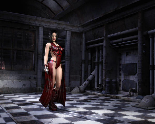
Ok, let´s go. This first one is called "The Hunter".
Any comments on my images are very welcome.
Thanks!


hunter.jpg
1000 x 800 - 230K


Comments
Nice lighting, surfaces and reflection of the figure in the background but a bit short on the composition in my opinion...this might be of use http://www.daz3d.com/forums/discussion/12654/ when it comes to composition
Hello Szark!
Thanks for the reply. But in fact, in this image I really took care about composition. I´ve learned a few things about it and I thought I did it right. Here are my thoughts:
- the right wall has a diagonal which gives the image depth
- the figure is framed by the back door
- the figure placement follows the rule of thirds
- the camera angle creates a dramatic feel
Don´t get me wrong, I don´t want to offend you and I´m sure you know more about those things than I and I am always willing to learn. So, could you please tell me what is wrong here?
Thanks, XoechZ!
You won't offend me
and too be honest I am not the knowledgeable about all this.
I really do like the lighting and feel of the image,
Nothing is wrong as it is your image to do what you want.... I just felt it lacked impact as all the empty space around your main subject detracts from the main subject. There is more to composition than rules too, like Dof can be a great composition tool.
I did a quick mock up of DOF in photoshop to show what I mean and did a couple of crops, hope you don't mind.
My intent is not from showing off but from what I see as a viewer and in the spirit of helping out.
I see what you mean. Thank you!
I like the DOF look as she realy stands out which is what you want sometimes from an image.
You are right, the DOF really makes her stand out. The reason why I did not do that is that I liked the detailed prop so much, so I did not want to blur it. But sometimes less is more :-)
I will keep the idea in mind for the next render.
LOL I hear you on that one but it is something you learn to deal with. I went through the same process as you. What blur my hard work, no not doing it....now I don't care. Whatever works to get great impact then so be it.
Another Try.