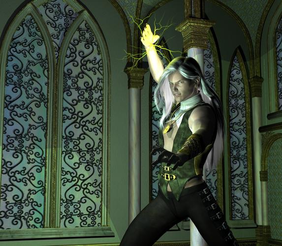
Finished render! But...what is this?
I worked on this one for the past couple of weeks and I finally got to rendering it.
After some weird issues with items randomly disappearing from the scene, this is what I came up with.
Because it's my first big render I am looking for some feedback :D
Any comments are most welcome ^^
Also, can someone explain to me what that weird dotting on the front hand is?
I tweaked it here and there and set the resolution higher, but it still gives me those weird dots on that hand only >>
There is no post work done on it yet~
For the image I used:
- M5 and tweaked it to my liking
- Lucian hair
- Notorious wardrobe which I gave different textures in Gimp
- Ethereal Silence
- My own lighting set
- Atmospherics lightning from RDNA
EDIT
I just finished a high res. version and the speckles are also on other places on the render, but very sparse.
Can be found here:
http://fc07.deviantart.net/fs71/i/2012/323/4/a/3d_gwen_by_estroyer-d5lgryq.jpg


Comments
I have to admit I couldn't see the speckling you were referring to, so I can't help you there. But I can give you some general feedback.
I love your character. The pose is dynamic and doesn't look stiff, like so many do at first glance, and the facial expression is subtle while doing the job. Also, the way the hair is blowing back just a bit gives action and implies something powerful is going on.
I like the lightning effect, and the yellow lighting on the hair which makes it seem very "there." One small thing to consider with the lightning is moving the central nexus point up a bit. Right now it looks like the lightning is coming from the wrist instead of his palm. Unless that's the look you're going for, of course. :)
Something else is that the necklace isn't laying flat against his chest, so the shadow underneath it can be seen. This gives the impression of movement in the opposite direction of the movement implied by the hair, so that's something to think about.
And I really like the textures on the clothes that you've added. I'm very impressed. The high realism of the clothes contrasts with the flatter textures of the room, which made me wonder if this character is posed against a backdrop instead of in a 3D environment.. Perhaps tweaking the amount of bump and displacement textures on the room will bring that into balance. Or perhaps choosing a different section of the room (such as having a column in the foreground) would help. I like the position of the character in relation to the camera though.
These are just some ideas from someone fairly new to this, so take them with a grain of salt. I'm sure others will have great ideas, as well.
(On a side note, have you heard of the Fabricator, which allows you to change the textures on clothes in DS4.5 easily? I love it, and the rest of its add on packs. I don't know how hard it was to change the textures in gimp, but you may find the Fabricator easier in some circumstances.:) )
Thanks for taking the time to respond, anything is helpful as I feel very clumsy with 3D still.
The necklace I made it airborne like that to incline movement, but I didn't notice it's in conflict with his movements ><<br /> Background, well, we never had a great relationship XD
I will look into your tips of bump and displacement textures, I really haven't played around with those a lot.
Awesome that there is software for changing the fabric, I have just taken a look at it and was bummed that it is rather expensive :(
But it is on my wishlist for sure and I hope extra textures can be added.
I didn't find changing textures that hard as I know my way around in Gimp, but it did took me a while to figure out the maps...I kept loosing track on which one I was looking for and working on ><</p>
And indeed, the lightening bolts could be placed a bit more towards his hand...oops!
It's nice to get some feedback, as most people I know just like everything I do...family and friends are lovely, but not for getting commented on the art department ;)
EDIT
I just looked into it and it does seem you can add extra textures to Fabricator!
I don't know...it almost seems like the pendant is being attracted toward the bolts of arcane energy...
I can't see the 'speckles' either...could you possibly use an image editor and circle them or something?
Also what were the render settings used?
mjc1016, that's a good point about the energy being what's pulling the necklace up. If the hair tips are pulled up too, or something, that would be a cool way to go as well.
About the fabricator and the other add-ons, those will most likely be 50% off in March Madness this coming up March. And you never know, there may be a sale that good on them before hand. If you locate the fabricator thread on the old forums, you'll see links to a bunch of freebie textures that people packaged to go with it. So that's pretty neat, as well.
Good luck on the background thing, that may be something that lighting could help, but I just use the packages from people like Lantios because I'm new enough to not have that down.
The various packs, add ons and 'similar' items that Marieah has in that family basically means that your clothing never needs to be boring, ever again.
I personally see no Speckles. What I see are High lights and shadowing that match the lighting used very well. A very nice Render that works. Of course we all think our own work is bad (most do) and that others can see things we don't (most do). The real test is you, if the image pleases you your done. If not then work on it more until YOU are happy.
I zoomed in on the speckles, click on the image to zoom it a bit better.
They are little white flecks on the dark parts...
I saw on the higher res render that they are mostly gone, but I have been scanning the image with my nose on the screen and I could see some scattered over the image.
Will be adding screenies from my rendersettings as well.
Going to check out Lantios's sets!
Oops I also spotted that the necklace isn't around his neck but is looping through the collar ><<br /> Going to fix that later...
True, very true.
I am going to finish the image a bit more in Gimp and I already wasn't too happy with the background myself~
So I already have my evening planned for today :D
Thanks for all your responses, they mean a lot to me!
Reduce your Shading Rate to a value less than 1 (the default is 2). This will get rid of the specks.
Also have your Pixel Samples equal your Pixel Filter.
I will try that after dinner :D
Okidoki!
I have been tweaking my image.
Also some post work done in Gimp ^^
Any thoughts/advice/tips?
It's always hard to say: ok now it's done XD
It looks a lot better. :cheese:
Love the picture! I'm not a critic, but the pose, hair and composition are quite appealing! Good work.
I like it a lot, too. How you placed the column in the foreground, plus the dark lighting, really adds depth and realism to the picture. It definitely looks like a 3D environment instead of a background, too. :)
Oh, hihi!
I had expected reactions to be like:'tweak the hair a bit more like this"or "adjust the shaders a bit more like this"!
I think I can call this a finished render now :D
In the weekend I'll be making a steampunk themed scene.
And I guess I will make my own thread in the gallery forum so I can spam there ^^
Thanks for all your much appreciated opinions!
You only need to look into some compo stuff now. Start with the Rule of Thirds.
Oh I know, I know ><<br /> I even had an arteducation LOL
Shame on me for not using it properly...perhaps I am too lazy?
Hmm...to be continued XD
LOL! I did too. Never use the stuff...
I learned things like: "always introduce a figure from left to right" (the other way around make it seem as if they are leaving or it must be intentional of course), "be good or be poor" and "a good story makes any art sell".
I was surprised we even learned some marketing strategy and that if things go bad on the economy, artists are one of the first to get hit because art is a luxery.
Oh, and we did art of course...sometimes
Six years of Commercial Art classes. Went Freelance, Sold TWO signs in as many years. But then the South US is not a good place to try to live on art in the first place. Many years later I'm back and doing 3D just for fun.
Great job! Sure looks done to me.