Everything is a WIP...Kismet2012's Renders
 Kismet2012
Posts: 4,252
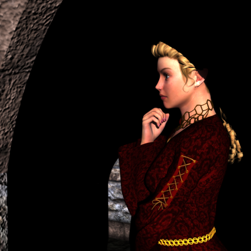
This is my very first render. I was quite proud of it at the time. Still am. Although if I were to create this today there are things I would change.
Unfortunately, in my inexperience, I deleted the file. I have considered trying to reproduce it and maybe I will someday...but there always seems to be so many other things to do, contests to enter, new techniques to learn it just keeps getting put on the back burner.
But maybe someday.


waiting.png
604 x 604 - 274K
Post edited by Kismet2012 on
Comments
I like the reflective nature- definitely deep in thought and I wondered what the character was thinking. I also like how the braiding going up the arm helps sweep the eyes upward. It is a very good render for being the first one!
Cathie
Thank you Cathie.
It is amazing what can happen when you listen to your muse. ;-)
Title: I'm Here For You
This is my second render. I had not yet found Jaderail's Golden Rules of Composition. As a result I have never been as happy with this one as I was with the first. I just did not know why at the time.
I have already tried to redo this one a few times but have never been satisfied. Not sure I have learned the skills I need. Perhaps someday.
Title: Where Have You Been?
This was not intended to be a finished product. I was testing shaders, posing, and DAZ Dimension Lights 1 & DAZ Dimension Lights 2.
This one is from August, 2013.
Testing RawArt's RoboGenll
Title: The Sentinel
1st image is one I originally posted (unchanged)
2nd image I turned the spotlight off
3rd image I changed the location and some settings on the spotlight
4th image used point light (I opted for Linear) as suggested by Novica
Title: South Bound Train
I absolutely love the look of Spirit of Punk but could not come up with an idea for a render. Finally I was inspired by a Harry Dresden Novel by Jim Butcher.
Title: The Eyes Have It
Entered this into the PC Inspiration Contest - April 9, 2014 and The April, 2014 Render Contest: What's New?
Title: The Great Wizard and his Young(?) Apprentice
Entered this into the April, 2014 Render Contest: What's New
I really like this last one! The lighting continues to improve (if you don't mind my saying so- I know mine is still WIP!) as there are more contrasts in the lighting.
One thing I've been experimenting with is using a dim point light lowered by the face- it gives a very nice subtle glow. Put it offside and it will cast a cool side light onto half or 3/4 of the face. I start with 6%, a dull bluish gray. (EDIT: thought about that for the African American/dark skinned render (The Sentinel) several posts above this one. Would light the face a bit.)
Thank you for the suggestion Novica. Lighting is always a learning process.
Did this one for Kulay Wolf who wanted a chocolate Gianni for Easter.
I have added some new renders to The Sentinel. I tried playing with the lighting on her face. There is an AoA Spot Light in the original. The last one I tried using a Linear Point Light. I really need to sit down and redo all the lighting in this some day.
Thank you for your comments and suggestions. They are very helpful.
Can't possibly go wrong with chocolate. Or guys who are worth their weight in chocolate. Gold is sooo overrated ;)
Title: Modern Day Pirates
I have wanted to create a render using Ocean Wide since I bought it in mid-March. Then I got Morphing Mask for Genesis and Genesis 2 and I really wanted to create a render with it. Sometimes it takes me quite a while to come up with an idea but I managed to combine the 2 items in one render.
Still struggling with lighting. Sometimes it seems to work and other times it is a struggle. But I will keep trying.
Thanks for looking.
Well, I know what you mean. ;-)
Have you ever tried to layer your images? That means render each light seperatly and combine them as layers in Photoshop or Gimp.
There you can play with each light and see how each light effects your scene. This helped me a lot to understand how to setup the lights in DAZ Studio. And is way time saving as rerender a scene again and again and again ... >:-(
Seems like you are familiar with the light concepts, you´re struggl is not with lighting. You´re struggeling with the question how the lights play well together! ;-)
I have not done any postwork, other than adding a signature block, to any renders. I have been slowly learning GIMP. I have used it to create seamless tiles and texture tiles.
Thank you for the suggestion.
Anything that helps me learn is worth trying.
If you already have done some work in Gimp it is really easy to do.
Just load one of the >Ready to Render< Scenes, like the Fiery Genesis. And give each light its own render.
In Gimp go to >File< - >Open as layers< and load your images. You have to create one new layer with colour black wich should be set at the bottom of all the layers.
In the Layer-Box now set each layer from >Normal< to >Screen< and play with each layers opacity ... have fun! ;-)
Speaking of Ready to Render Scenes have you noticed this one: http://www.daz3d.com/tutorials/sci-fi-warrior-bundle
Funny you should mention that one. I was playing with it last night and I was just thinking I could use it to test out light layers in GIMP. :cheese:
Those Ready to Render Scenes are perfect for layering in Gimp or Photoshop.
You can always do the intended complete render of the scene and compare it to your own outcome in Gimp.
That helps a lot to understand the overall lighting used in this scenes. ;-)
I´m very happy there is a new one for free. It is still fun to me playing with those premade scenes using Gimp. :coolsmile:
Did this one for the weekly PC Contest and also entered the PC Members Monthly Contest What's New.
So glad there are so many contests to enter. I find it helps give me a direction and some of them force me to try themes I probably wouldn't do on my own. Not to mention all that practice and feedback.
Thanks for looking.
very nice renders...as you know I am having a hard time with lighting also so I went back to the basics with my last batch of renders....one spot and one distance light....sounds simple but I have been rotating the distance light around and it seams to be working for me....Trish
It never hurts to go back to basics. Your renders look amazing. Love the last one you did with your own background and Ron's brushes.
Kismet-
When looking at Modern Day Pirates...
Perhaps consider that if your characters are looking to the left, then put a distant light on that side to illuminate the faces a bit more. You can also use a linear point light and lower it closely to the driver's face, and put a small drop off number so the light doesn't extend out very much. Or use a spotlight set on about 15-25% with shadows really soft (40% up) on the driver's face. He's pretty dark, but that just might be my monitor. :)
Remember you can also tweak the skin surfaces in Surface tab to lighten the skin and make the facial expressions and face show up better.
I like the composition of your scene and the intent is really obvious due to the really nice positioning of the weapon- it really stands out against the background- nicely done! Your horizon line is excellent also, it leaves just enough sky to make it interesting but doesn't dominate the scene.
On the last render, I love the fold of the wings in the foreground, what a delightful touch, and that she is looking down and just totally relaxed. The pose is beautifully done. That should be a real contender in a contest.
Thank you Novica. You give such great advice.
I'm not much of a gun person so am not really sure where the Modern Day Pirates concept came from. I will revisit the lighting in that one.
Sometimes I spend so much time and effort on the posing and composition that by the time I get to lighting I have run out of steam. Really need to work on my work flow. ;-)
Created this using Flipmode's new FM Night Builder.
This was my version of a random item generated render. I have posted a close-up of her face in the New Users May, 2014 WIP thread.
I am glad you posted the full render here....I was wondering about what the rest of it looked like ...your lighting is very good...and I like the over all composition......Trish
Thank you Trish. :)