Non-photorealistic Renders (NPR)
This discussion has been closed.
Adding to Cart…

Licensing Agreement | Terms of Service | Privacy Policy | EULA
© 2024 Daz Productions Inc. All Rights Reserved.You currently have no notifications.

Licensing Agreement | Terms of Service | Privacy Policy | EULA
© 2024 Daz Productions Inc. All Rights Reserved.
Comments
Thank you! I'm putting thought of the slash and decided to go with a more simplitic approach. I'm also working on test layouts for the pages now. Here they are so far!
You're welcome for the comments. I think this looks interesting.
I don't want to go into a lot of it here (I only have about 30-45 minutes before I have to go to bed, and I really want to work on texturing a character I'm having trouble with). But would you be interested in hearing some very specific critiques on these pages? I like them in general, butt here are several things I would suggest, primarily about the lettering, if you're interested in hearing my thoughts. And I kinda like the updated logo, but I also liked the old one. It was maily the texture/fill that was affecting legibility for me. What if you made the J bigger, but kept it aligned to the top of the other letters and let the desceender go down below the bottom of your underline? Just a thought.
My holidays are over, and unfortunately that means a lot less time to render. At the moment I'm experimenting with filters and I really love that you can turn a normal render into something totally different. Here is something I did with the Nik filters which are free.
Very cool. I have Nik, which filters did you use?
These filters are great. For this I used one of the Silver Efex Pro 2 Filters and tweaked it until I liked the result.
Ahh, thanks for the input on that, and I don't mind constructive criticism as it has got me much farther than I did :). And I'm interested in your input on the lettering. as for the panels, these are just just layout before I start coloring through photoshop.
You're definitely getting far with this project. I'll work up my comments soon (on deadline today, and I'm working on a long series of blog posts).
Sorry I've been so quiet these past two weeks or so. Busy, busy, busy. Just put that fanzine to bed (the one with the two-page Contents illustration), and I've got a new work project ramping up (gotta pay to keep the lights on, you know how it is). And, silly me, started a short tutorial on my noir illustration technique, and it's ballooned into a large tutorial. I'll post a link to it shortly.
I also thought you guys might be interested in this thread (if you don't know about it), as it has a lot of very nice NPR work in it: https://www.daz3d.com/forums/discussion/153221/old-dog-new-tricks#latest ;
Hey everyone. Still leaning Manga Studio. Here is a practice render I initially did in Manga, then threw all my other techniques at it.
Whoah, Sick! I love the shading and texture of this ship!
Thanks. I'm mostly please with how it turned out (I am my own worst critic). The more I learn Manga Studio, the more I like it, but my old techniques can still enhance the look quite a bit.
I just saw this in the gallery! Very nice. I've been debating about getting Dogwaffle. It's very nice to see some of what it can do. You have a striking, forlorn emotion in this image.
This turned out great! Nice definition and shading.
That's really cool.
You created a classic, fairytale scene here. The two characters are so detailed in regards to expression and body language. Nicely done. This is also an interesting effect. The only thing I notice is that there isn't a lot of contgrast between the foreground figures and the background. If the background were a little lighter, the to lead characters would "pop" a little more. Nevertheless, this is a nice,romanic scene. I really love the details onher dress and his clothing. Thanks so much for sharing it with us.
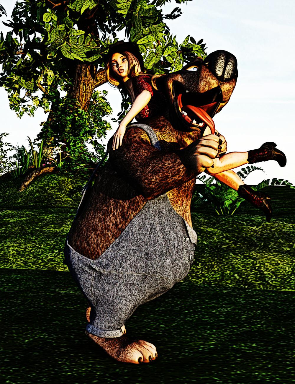
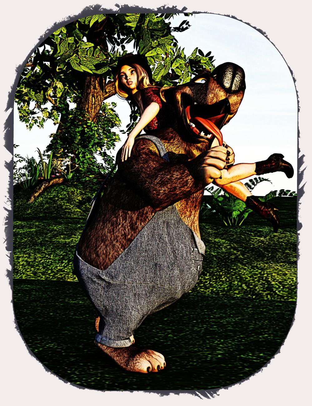
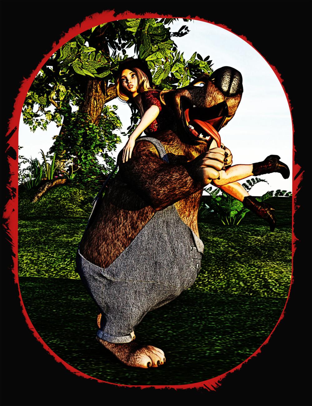
I've been playing with Snuggles the Bear. Just couldn't resist him when he popped up in the store. I came up with the following image experimenting with layering some new filters. I really like how my final image turned out, but I thought it was missing something so I tried some framing. I came up with two frames that I really liked, but they are markedly different and I'm not sure which one I like better. They both have points for and against so I'm looking for opinions: with or without the frame and if framed which one and why?
Original with Post:

With Frame 1:

With Frame 2:

I like the 2nd one. The 3rd one makes me think of blood. Maybe I need therapy. lol
Good day all,
I am learning to do toon shading in preparation for a series of animations I will be making. I am realizing that any and all generations are optional with toon shading. This is Victoria 3 with the Firedancer outfit ... simply done with Visual Style Shaders and Toonycam Pro. I like the effect, but what would improve this in terms of proper toonifying? Thanks.
Lol, you actually aren't the first one to mention that. A friend told me the same thing and said he thought it reminded him too much of a horror movie or something like that. I appreciate the feedback. :)
I used various topaz lab filters on this one. I can probably improve it with some additional hand draw lines but trying to make them nice and clean will be the trick. Maybe I'll test how my line work looks when drawn in photoshop, clip studio and leonardo. At the very least, that would give me some much needed practice. If I follow through, and I get results that aren't too embarrassing, I'll report back on which program worked best for me.
Like you, that character was just too darn cute. If I weren't saving my money for something else right now, he would have definitely come hom to my Runtime!
The poses and scenes are good (although that big tongue makes me think he's planning to eat her), and this is emphasized in Frame 2, which definitely looks like blood and changes this to a horror image. Frame 1 is cuter.
My concern comes with the clash between detail and comic style. The render is too realistic, what with the texture on his clothing and fur, and it clashes with the toon sensibility. I would suggest running the Topaz Simplify filters (if you have them) to change the texture of his clothes into a single block of color. Ditto for the furn; we only need a few strands here and there to convey that it's fur. Or, try rendering it again without the pumpb maps (or maybe a toon render and use it as an overlay).
Anyway, have fun with this figure! I'm looking forward to seeing more of him soon.
You touched right on the first thing I thought of: the inking/lines. This is a pretty good scene with lots of emotion. You can definitely read hopelessness and dejection in the character's face and body language. If I were going to suggest a way to tighten up the composition, it would be to simplify the panel designs behind his head, and then to try going with darker lighting. If he's in a simple spotlight or glow (or if the only light comes from the hallway so we get those cool bar shadows playing across his body), that would emphasize the lonliness of the scene. Overall, though, thhis is pretty top notch and I look forward to seeing what you do next!
Thank you @mmitchell_houston. I've been working on learning better posing and expressions and this is the first time I've been really happy with those two elements. I completely agree that focusing the light on the character would be better. In face, I did that on my photorealistic render which is in my thread and in the gallery. Shadows from the bars is an excellent and dramatic suggestion.
You're very welcome! And your hard work at mastering poses and expressions is really paying off.
I don't normally link to my blog, or mention it for that matter, and I hope it's not against the Forum Policies to do so, but I'm writing a detailed tutorial on my Noir Comics Style, and later today I'll be posting the latest chapter. In the meantime, if you're interested, you can find it here: http://mikemitchellonline.blogspot.com/search/label/Tutorials
Sorry, but it will load in reverse order (newest one first), so if you want to go back to the beginning, you'll have to scroll down.
Again, if this doesn't quite meet forum guidelines, let me know and I'll voluntarily pull this myself.
Don't know if this matters, but my blog is 100% work safe.
I have been making a few renders so I could learn more about post work in photoshop. Basically I have felt too much in a rut with my workflow. There are styles and layers and oh my I just needed to just practice. This is the result. I also have some test renders which have no background and these make great practice because it allows easier masking.
This is another where I was working on the layer effects. It was a black and white render on blank background.
hey that looks spiffing , thanks so much!
Great looking images, Lorraine Purviance. I like them, especially the second one.
I really like the second one too. Nice water effect.
Thanks so much for coming by to share these with us. As I told you before, I love what you're doing with texture. In this image, the addition of the bubbles are a GREAT touch. And you create such interesting characters.
Thanks! naturally, right after I post the links here, I miss my deadline yesterday. I was working on it when inspiration for a comic script hit me, so I completed that, instead. I will resume work on yesterday's post tonight after work.